THE TECTONIC GRAIN
Adapted from a lecture by Nader Tehrani at Design Republic, Shanghai for Manifesto 21, 2017. DOWNLOAD PDF

TECTONIC GRAIN
What do I mean by grain? The grain is the constitution of matter that produces organization, such as a pattern, a stripe or a checkerboard. When we look at the zebra, we take for granted that it has stripes. As we look at nature, we commonly identify grains much like this. However, as you look carefully at the first image, you realize that something is amiss. The natural grain of the zebra tends to go perpendicular to the orientation of its torso and limbs. It is only when we manipulate the orientation of the grain that we understand the artifice behind the architect’s craft. Architecture has nothing to do with nature and everything to do with that which we force it to do. So when Louis Kahn asks what the brick wants to be, he is actually pinpointing the architect’s agency in giving willful form to the organization of bricks, knowing fully well that while brick aggregation offers some constraints, it is, in fact, the designer’s instrumentality that pushes the invention of new forms of structural, decorative and organizational adaptations.

CONTRASTING GRAIN
We know that the natural grain of wood has an agency of its own. But it’s actually our use of the saw (rift-sawing, quarter-sawing, live-sawing) that produces the graining patterns familiar to us. Each sawing method is adapted to different grades of wood, differentiating its use as flooring, hardware or millwork. Each is more or less efficient in its use of the log, and the expense is calculated accordingly.
In the case of this table, two corresponding yet contradictory tectonics were used. One was the technology of veneer grain, thin and laminar much like the Eames furniture, and the other was the technology of butcher block technology, here adapted through laminated plywood, which becomes solid, compressive, and massive. The striations of the butcher block laminations and the grain of the quarter-sawn veneer come together on the corner producing an oblique symmetry between contrasting technologies. When the butcher block is cut diagonally along the inside of the leg, a figurative aspect of the grain is revealed.
The folly in book-matching striping on the oblique is that one cannot simultaneously retain symmetries along every edge. There will always be a moment of asymmetrical rift, one edge where the butcher block grain and veneer grain run perpendicular to each other. This piece of furniture is a kind of essay on the impossibility of bringing things together and finding ways for the grains to cohere. Quarter sawn Walnut on the outside, zebra wood on the interior and stacked plywood as structure, the three striated patterns come into conversation on the oblique.
If provenance of this argument all seems remote to architecture, think of Santa Maria Della Pace in Rome. The classical orders produce a rhythmic cadence as they march towards the corners, until suddenly they are swallowed up and engulfed within the corner itself. Perversity? Negligence? What happened there? Was Bramante a witty and humorous guy or did he simply fall asleep at the wheel? If you look through history at the way in which Bramante was subsequently translated by Palladio –and generations later by Mies Van der Rohe in the IIT, you begin to realize that the importance of the grain is not so much about the way in which the striping is created on one face, but almost always about how it turns the corner and deals with exceptionality. This table speaks to that very history.
POROUS GRAIN
Within this context, the Rock Creek House has a certain kind of critical agency. An adaptation of a four-story historic structure in Washington DC, with a half -basement and a roof attic, our job was to maximize the square footage of the house by making both the basement and roof occupiable: expanding the house without adding onto its footprint.
As you inspect it, the house seems relatively benign. It respects the brick structure of the building, with windows that are either carved out, flush, or popped out, but it’s nothing extraordinary beyond that.
One of the main requests of the client was to maximize the sunlight on the southern face; on studying the plan, the challenge became how to maintain the load-bearing structural order of the building while opening it up to spans that would require other forms of structural support, beyond masonry. For this reason, we developed a hybrid structure accommodating its load-bearing walls on the north, while opening up the south to a ‘free-plan’ organization. This had a radical impact on the structure. The expanses of glass on the south, naturally, necessitated steel, and as such, we transformed the south face into a curtain wall. The tectonic challenge was, how do you turn a loadbearing brick wall (on the north) into a curtain wall (on the south), and what that would entail in the transition zones of the east-west wall that bind them together. As such, the building plan has to evolve in such a way that the load-bearing wall of the north is translated to the existing north-south structural brick walls which support the curtain wall on the south.
The southern façade has its moments of articulation, alternating between flush, inset and popped out conditions, but also the corners, whereby the wings of the building exert themselves into the landscape. In the south-east corner, delicate inset steel columns suspend the brick on the outside, using the glazing as a picture plane to reveal the tectonic ruse. The corner windows become opportunities to carve deep areas of occupation, allowing for furnishings that appear as extensions of the plywood grain that structures the house.
In section, a new double height space from the ground floor to the basement opens out to the garden to the south, and the former attic is opened up in section with an atrium connecting the kids’ homework room on the second floor to the playroom on the top floor. A winter living room is located at the entry level, while a summer living room below connects to the garden. Diagonal views pass through the building connecting spaces to each other, using the free-plan to create a connection that a load-bearing wall system would disallow. Upon entering, there is also a unique window which peers into a cavernous oculus revealing a descending staircase to the garden level below.
The striated logic of the millwork, runs north-south, much like the bearing walls, reinforcing the porosity of spatial continuity between the southern façade and the nested spaces within the northern portion of the house, allowing sunlight deep into the house; in contrast, the east-west faces are opaque and expressed as solid wood veneer, giving privacy to bedrooms and other domestic areas. All of the millwork is coordinated with electrical, lighting, diffusers and other fixtures, such that the logic of the north-south axis becomes apparent. The hardware of the building is also concealed within this logic. Services like the kitchen and family room can be concealed by large sliding wall panels so that they appear to be without doors, and completely solid.
TOLERANT GRAIN
This idea of striping becomes ammunition for a project we completed in Seoul, Korea –where we didn’t speak the language and had no special connection to the construction industry. We essentially used four details to control the project.
The project was for a “model home gallery” for Samsung. As precedence goes, the model home gallery is a building typology that has the appearance of an extravagant cultural institution but is, in fact, a retail outfit. Companies like Hyundai, Samsung, and others use the model home displays in their galleries to sell apartment units all over Seoul. At ground level, they provide public amenities to the communities within which these ‘long-term’ temporary buildings are built.
The idea of the building was very simple: produce a glass base that draws people in from the adjacent streets, the park and subway system, while offering one vertical moment of visual connection to the retail above. Typologically, it is simply a glass box at the base with a dumb black-box at the top: nothing more, nothing less. We pondered how to give definition to this building type that found itself in between an empty barren landscape on one side and on the edge of a new park with a subway station linking it to the larger metropolitan region. It was promised that the site would become a dense urban corner, but we had not imagined how fast that might happen: within one year, all of the buildings around the park were built.
We developed the working drawings for this project, including the protocols for the digital fabrication of the details that required some complexity. We sent off the package at the end of October and we didn’t hear from client group. In January, abruptly, we received an image from the job site. They had built the foundations and were already building the slabs above but they called us to ask advice about how to turn the corner because they had run into some geometric issues. In fact, none of it was being built digitally. It was all being done manually, as it turns out, predominantly by Chinese labor, coordinated by Korean engineers and site job captains. Thus, we were reintroduced back into the project to bring clarity to the various working parts of the project. Luckily, the building was conceived from four basic material assemblies and their requisite details. A granite floor that runs right through the building, a vertical storefront that has a certain cadence in relationship to solar performance, a series of louvers that break up the compound curvatures of the aluminum panels into discrete parts, and a plaster interior.
Conceptually, the project is about developing the lowest possible communicative denominator to build the structure without knowing the local language. Due to the lack of detail in this building, there was nothing that could go wrong. That wasn’t the case of course, but you wouldn’t know it because it’s detailed for maximum tolerances such that misalignments just don’t matter.
At the base, deep vertical fins protect storefront glazing from east/west sunlight, on the north, the mullion bays are spaced with larger spans. Vertical fritting in between the mullions protects the interior from the southern exposure. The base of the building has two forms of structure. One is a robust structure that supports the building above, and the other is a finer steel filigree that holds up the glazing. Above, horizontal louvers are pried open in the few moments where light is permitted into interior public spaces.
Conceptually, the ground level is an open promenade that allows the public to filter through the building. The plan diagram is that of a hypostyle hall where primary programs such as the auditorium, VIP rooms, and conference rooms become monolithic masses as if thick columns. The section diagram is such that architectural elements like skylights, columns, and staircases suspend down from the mass above. All of the lighting and the mechanical equipment are hidden within the striations in the ceiling.
There are key moments of typological transformation. For instance, we aligned the ramp down into the garage with the slope of the auditorium’s stepped floor and eliminated the back wall of the auditorium such that it produced both a theatre in the round and a proscenium with a view from the stage out towards the landscape. When it is not a gallery it becomes a theatre for novel encounters and programs bridging inside and outside.
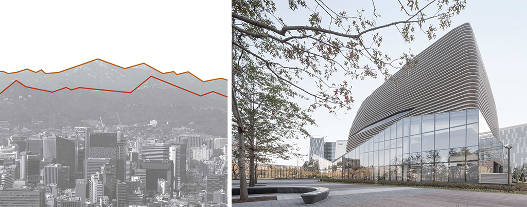
The massing of the building is the result of a domino frame with sliced corners and subsequently shrink-wrapped with a striated skin. The smooth figure of the building mass above operates on the oblique and is meant to be viewed in the round, in contrast with the prismatic apartment buildings of the neighboring skyline. In turn, the base is formed on triangulated figures that are formed around the approximate programmatic requirements of the public realm below. Each speaks to the landscape of Seoul in a different way: on the one hand in contrast to the repetition of conventional apartment buildings and on the other the mountainous landscape that frames the city.
In essence, the building is built with a sense of resilience to all of the things that happen in construction but maintains its commitment to the four key details that protect it from precision. The animated diagram of the building demonstrates its stubborn simplicity: a patterning of a tectonic grain at the storefront distributes itself in relation to the solar performance. As you stack that with different programs underneath, it begins to compact and enframe the public programs at the base. The louvers at the top conceal the black box but then, at moments, they open up to wink back at you.
RELENTLESS GRAIN
This graining of material has a direct relationship with different construction techniques. With the New Hampshire house, we had the good fortune of designing a house on a mountaintop that overlooks the entire Presidential Range. Each room is designed to be on axis with one mountaintop, including Mount Washington, Lincoln, and Lafayette, etc. Each room is a prefabricated unit laid out in a radial plan that protects a central court. Think of the many circular building precedents, the Panopticons, the Tulou (round earthen buildings in Fujian) that you may be familiar with in China, in combination with the dog-trot building type, whose void between two enclosed rooms provides for lateral outdoor connections.
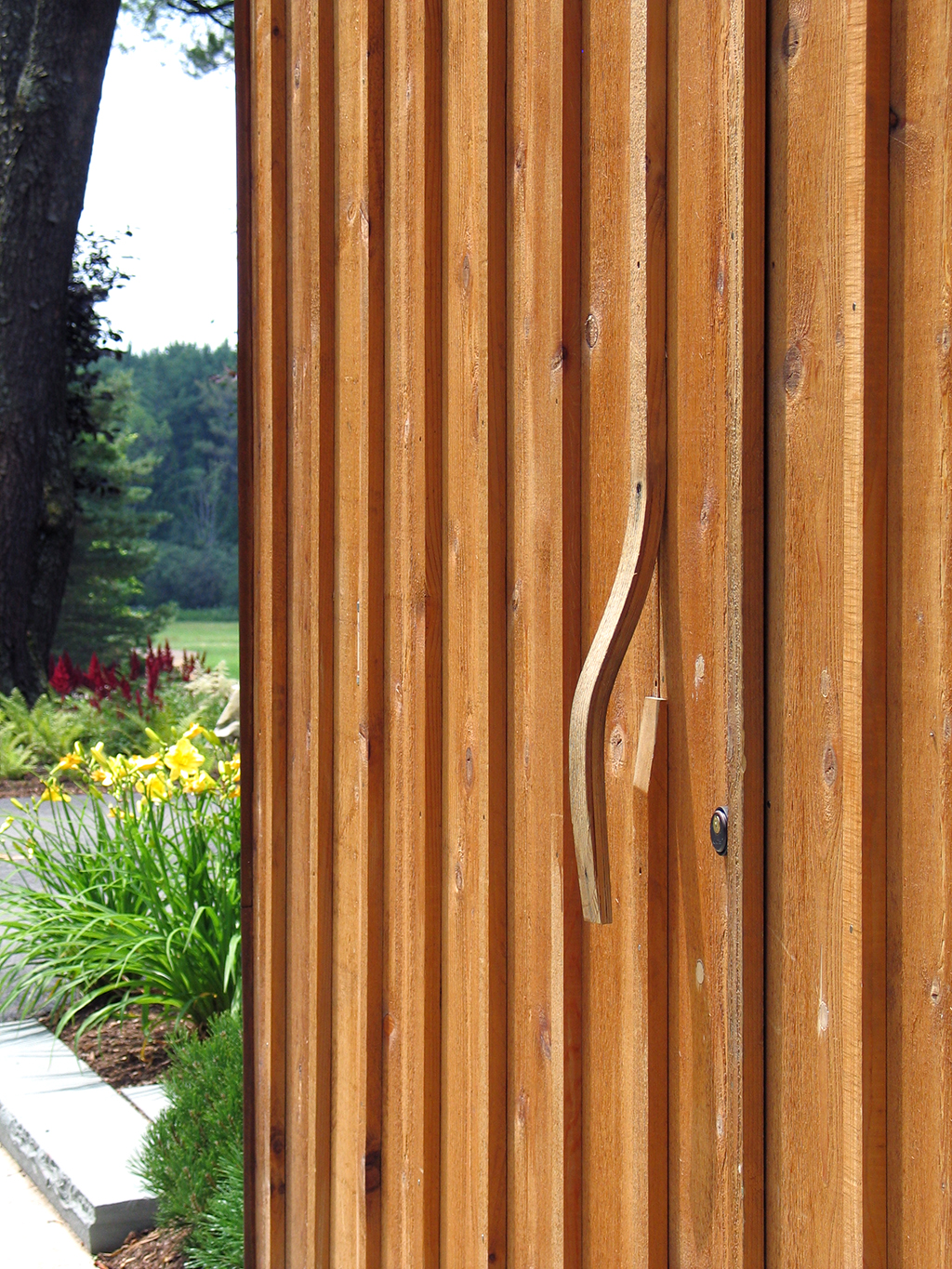
This project builds on the board and batten tectonics that we adopted in the New England House. Note the lack of hardware, as the garage doors are formed from a delaminated and bent extrusion of the battens. The tectonic grain stubbornly appropriates all architectural elements, causing all hardware to be absorbed by the grain of the vertical striation.
For the New Hampshire Retreat, the grain of fins, tongue and groove boards, board and batten, and logs all amount to a tectonic strategy in dialogue with each other, and in one key moment, producing a ruled surface, whose figure corresponds to the culmination of the project’s promenade: a stair to the roof deck, where the entire panorama is available unconfined. This ruled surface also vaults over the main entry into the house proper.
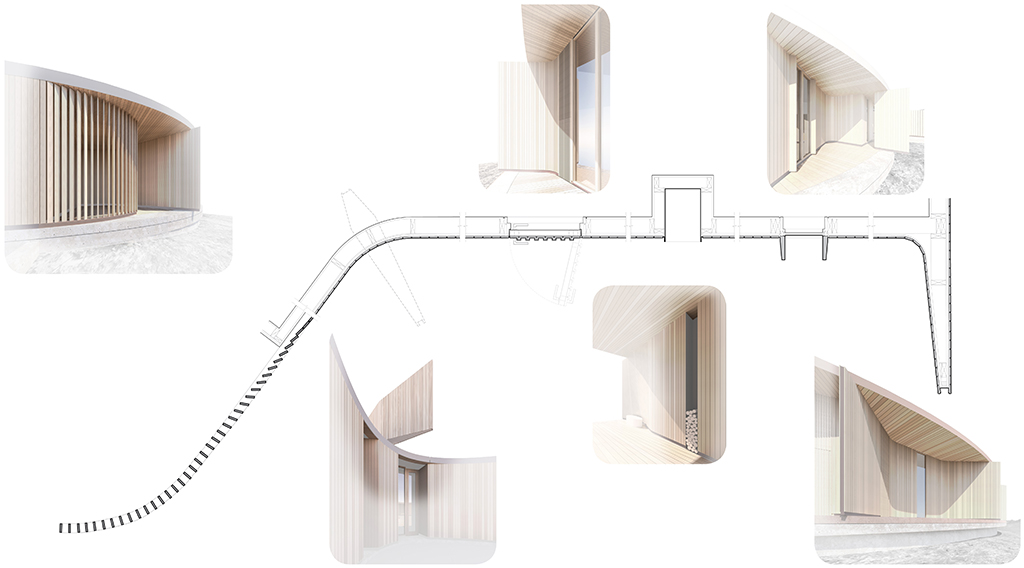
The project builds a part-to-whole relationship of this graining proposition. The rooms together produce a grain at the macro level while the vertical grain of the structure, pickets, and skin elements operate at the microscale. Together, these become the vehicle around which one is able to produce the ultimate relationship between the inside and the outside.
The technique of composition is not without precedent. Louis Kahn’s Dominican Motherhouse and James Stirling’s Wissenschaftzentrum both demonstrate how the connections between disparate building types are brought together through overlaps, collision and hinging. We build on this predicament but instead develop fluid techniques that graft surfaces together, conjoining disparate spaces into continuous realms –effectively melding forms and spaces together.
CORRUGATED GRAIN
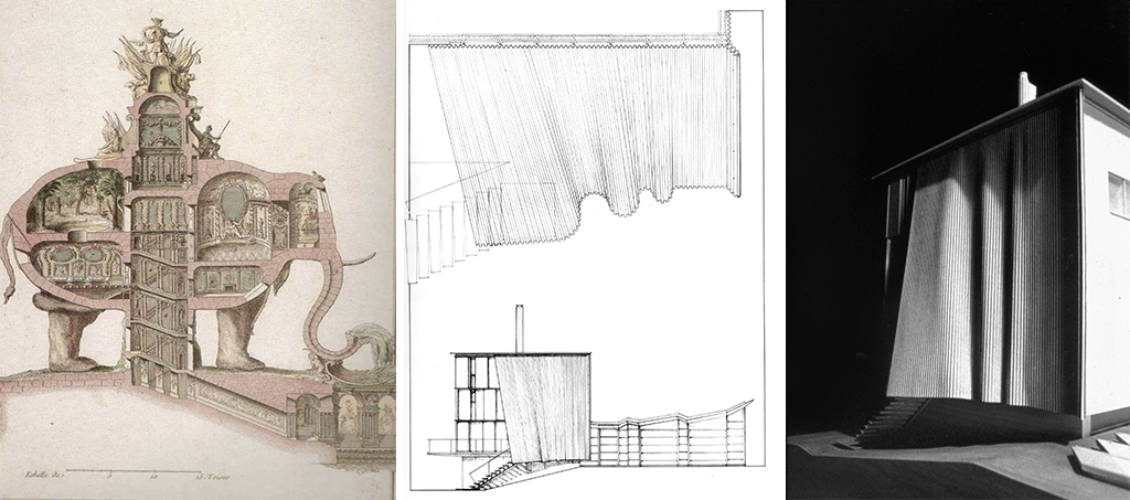
The above left historic image by Lequeu conveys the direct relationship between the figure of the elephant and the programs of the spaces that it sponsors –such as the trunk which serves as a fountain. For the Weston House, we were tasked to add another floor on top of the existing building. We used corrugated metal as a cladding surface to wrap both floors, and offer an organic and singular identity to the house. We were not content to just re-skin it. We wanted to explore the possibility to expanding that skin so that it becomes spatial, to produce an awning between the living room and the garden and even allow for the insertion of a new flight of stairs.
The idea of graining in architecture takes on much a more spatial proposition in this project, and in designing it, we discovered something that we had assumed but could never fully articulate: in architecture, drawing is not merely illustrative or pictorial. It is always already an act of construction. If corrugation is oriented on a vertical axis, that means it is also malleable on its horizontal axis. Note that the line at the top is exactly the same length as the line at the bottom. That is what proves the theorem of a ruled surface, alternatively called a developable surface. In inspecting the drawing, we already know this is buildable because the geometric principle that guides the drawing is based on a constructive idea, both physical and representational. At the same time, the very principle that geometrically delaminates the surface produces the possibility of depth within the surface: a skin that envelops space. Beyond geometric abstraction, we also become aware of a semantic aptitude that is embedded in the idea of this ‘curtain wall’, something that creates associations, builds referentiality and begs interpretation.
An apparently similar derivation of the curtain wall in Casa la Roca prompts a completely different set of discoveries. While drawing this project, we were focused on the work of Sigurd Lewerentz and, in particular, how his monocular focus on brick aggregation coerced certain inventions that would escape conventional bonding procedures such as the running or Flemish bond. Instead of centering his attention on the brick itself, we discovered that Lewerentz was more targeting the space of the mortar as the site of play. In some instances, brick can be seen floating in a ‘field of mortar’, a-tectonically suspended. This discovery led us into proposing the “Variable Bond”, whereby the dimension of the mortar bond can vary over the length of the wall, creating lateral shifts on the X and Y axes, and in turn, introduce the possibility of light and air through the brick membrane. Controlling the bonding also enables us to fold a single wythe of brick along the diagonal axis of a bonding pattern, giving structural depth and lateral stability to a substantially thin wall, extending the tradition of Jefferson’s serpentine walls at UVA. The project extends this discussion through the works of figures like Eladio Dieste and Frank Gehry, whose figural walls are the results of significantly different procedures. Dieste’s inventive structures are hybrid in nature, the result of the layering of brick, rebars, and mortar acting in tandem to structural shells: pure structure. Gehry’s walls, on the other hand, are the result of the layering of varied laminates, with the skin serving as wallpaper, a symbolic vestiture that seeks no direct relationship between the walls parts and its whole. In the case of Casa La Roca, the relationship between the brick, its bonding organization, the structural folding of the wall, the environmental aspects of its ventilation and illumination all contribute to creating reciprocities in its part to whole relationships.
BRANCHING GRAIN
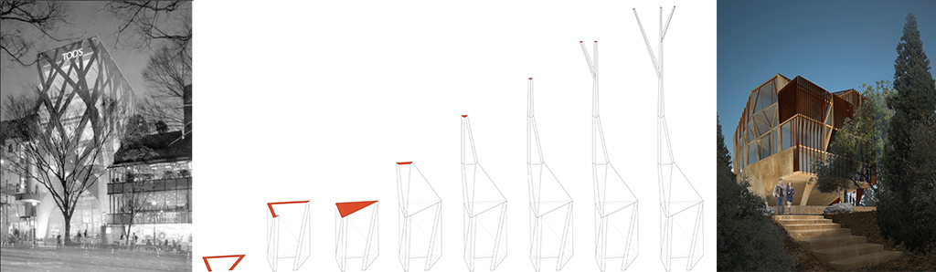
When I first saw Toyo Ito’s Tod’s published some years ago, I read into it certain possibilities that were not actually built, but latent within its organization –aspects that reinforce some of the arguments in this discussion. From an organizational point of view, I thought that the structure of this building, as evident on its facades, was also a diagram for the spatial subdivision of its interior, effectively a bosk of columns branching up towards the building’s top. By extension, I also noted the semantic relationship between the figuration of the facade and the trees in the foreground, whereby the building attempts to somehow mirror its natural context through architecture. When I finally visited the building, I realized that its interior is actually devoid of the interpretations onto which I had projected. None of the organizational tropes of the facades are indicative of its interior layout; It operates more as a decorated shed.
Concurrently, we were shortlisted for the Issam Fares Institute competition at the American University of Beirut. The shortlist was composed of a few emerging names, alongside Zaha Hadid, whose reputation had already crested, and whose prior affiliation with the school, as alumna, had in our minds already secured the outcome. This allowed us to freely engage in the competition as an intellectual enterprise without the illusion of victory. For this reason, we wanted to use the opportunity to complete Toyo Ito’s project in a way that was latent, but never yet adopted. We knew the image of this building before we started designing it. We knew that because it would be amongst these trees, it would not be in dialogue with the campus’ historic architecture, per se. It would be, instead, camouflaged within its flora, behind the palm trees, the cedar, the pine, and the monumental ficus. Effectively, we knew that our project needed to develop the morphology of the ficus as a spatial and structural system.
The question was, “How do we design that tree?” Note that a hexagon, when truncated, becomes a triangle. When extruded it becomes a column, when expanded at the top it becomes a piloti, when rotated it can transfer loads, when straightened up a simple wall. A simple geometry can take on many architectonic functions. Operating on a site in the round, the stacking of programs required multiple orientations; for this reason, we used the variable geometries to develop a structure that could be heavy at its base using its poché as the foundation, then lightening the structure as it transfers from one organization to another in the middle of the building, and then branching open at the top of the building at its top.
If viewed as a domino frame, the building organization allows for deformations that absorb its variations as part of an organic system. The system allows for the cantilever of the structure to allow the Ficus roots on the west side to thrive, it allows for diagonal and transfer spans in the auditorium section at the base, and so too the lightening of the column grid at the top. Its floors become a structural diaphragm, not only acting as dead-loads but acting in tension and compression as part of the dynamic triangulated system that builds the overall structure.
Thus, the building becomes a direct index of the way that the structure is performing. Program, skin, and structure come into direct dialogue with each other. The grain of the building is not its surface, per se, but the entire three-dimensional jungle-gym structure, the spaces it creates, and the anatomy it produces.
SCATTERED GRAIN
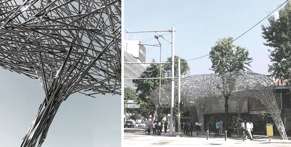
If the dominant protocol for our operations biases a part-to-whole relationship between the constructive unit and the building’s figure, not all projects allow for that reciprocity; in those instances, we have sought to radicalize an alternative approach. For the Gwangju Biennale, we initially designed a light tensegrity structure, whose organization allowed for minimal points of contact with the ground, where many infrastructural systems of the street, and subway system, were at play.
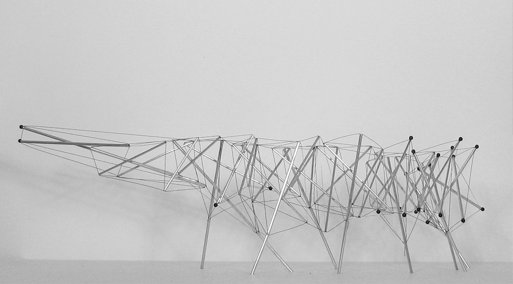
With an early submission of our working drawings, it became clear that the complexities associated with tolerances created a project that would be insurmountable in terms of both schedule and cost. In reviewing our CD package, the client remarked: “We love it! Do you mind if we just introduce compressive elements instead of the tensile ones?” This meant that we had one week within which to establish a new project, a project that could thrive under maximum tolerances. We thought that if we were going to really have to redesign this, let’s think of it economically, strategically, and produce a divide between the configurative and the figurative realm, such that the reciprocities we conventionally construct between part and whole are overturned.
Thus, we identified the largest single figure the site could take, respecting the location of trees, while minimizing the structural struts that meet the ground.
Without an a priori tectonic system in mind, our challenge was to develop a system of connecting parts for the proposed ‘cloud’ structure. Working with stainless steel door handles as round extruded struts, we developed a structural approach that would ‘fill’ the proposed figure of the pavilion, triangulating to gain maximum lateral strength, while minimizing density. Acknowledging that columns, capitals, and canopies react to different forces, the densities of struts in different areas varied, effectively swarming to reliable structural performance as required.
For the construction, all we gave the builders was the figure that was produced by the overall form of the pavilion and the requisite density of structure in each of its parts, with the construction method of welding each stick three times to ensure triangulation…….and then with a note to shake the structure periodically to test its sturdiness. Without precise coordinates for each strut, this new process allowed the structure to be constructed without technical drawings as such. Part and whole were divided and reconnected through a process of improvisation, testing, and teasing out of tolerances.
On the one hand, I’m making an argument about figuration, and on the other hand, an argument about configuration as its pre-requisite, and the reciprocity between the two. The bowl and the nest seem to be two different things but are in fact two sides of the same coin. One starts from the bottom up and asks what can be built with a blade of grass? The other begins with a platonic ideal and erases the grain of construction within it.
SUSPENDED GRAIN
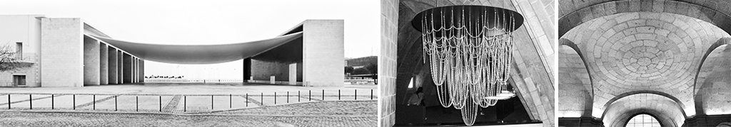
Much of our preoccupation with material research translates itself into larger and more complex buildings; our three schools of architecture, in Atlanta, Melbourne, and Toronto offered opportunities to advance some of this thinking. Consider the suspended concrete tarp of Alvaro Siza’s Expo Pavilion in Portugal; consider Louis Kahn’s unbuilt Palazzo dei Congressi in Venice and how the bowstring truss becomes an inhabitable space of the congress hall, with its raked figure as the base of the auditorium. Consider also the catenary experiments by Gaudi and how they become the mechanism by which to optimize structure. For us, the “Compressive Catenary” project became a way to test out how we could take the structure of the catenary and produce an inhabitable space out of it.
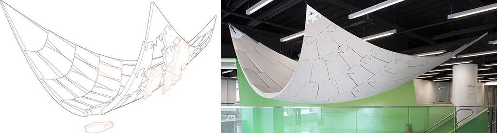
The idea we had was born out of a fascination with the flat arch that lies underneath the monastery of El Escorial, the result of compressed dimensions, the necessity to span, as well as the need for a flat floor above the vault. Indeed, the history of architecture has produced many extraordinary vaults, and yet they are also all characterized by a corresponding ground, but rarely does one impact, or determine, the other. The radical constraints of El Escorial produce an alibi for this subtle invention, extending the logic of the keystone along the length of the entire vault if only to defer to the structural forces laterally to their ultimate destination at their edges.
If an arch is marked by a keystone at the top, for our hanging vault, we needed to invert the keystone by making interlocking puzzle pieces to ensure that the compressive blocks could act in tension. In turn, as the keystone elements are displaced to the side, the central point is overtaken but an oculus, serving as a reveal between the three vectors that define the vault.
However contradictory it is to intuition, the idea was to develop a light-gauge compressive structure that operates between tension and compression, and equally importantly, something that can serve as a constructed ground. This is a principle that that translated directly into the Atlanta and Melbourne projects, where the research on suspension becomes a transformative pedagogical tool.
At the Georgia Tech School of Architecture, we used the gantry crane above to delicately suspend an entire studio space –the ‘crib’– in order to maintain the flexibility of the ground level. In the Melbourne School of Architecture, where there is no budgetary allocation for a dedicated studio space, 22 meter LVL beams span the atrium and form the structure for a totemic suspended structure that served as the only dedicated series of studio spaces. The structure is massive and volumetric at its top, extending down the studio walls in a kind of bas-relief, and eventually thinning out to plywood veneers at its base, where the surface of the cladding serves to create a coffered acoustic ceiling that hovers above the great hall. The transformation of this tectonic system can be seen as an inversion of the classical system, whereby weight is traditionally given to rustication at the ground, with ascending thinness attributed to the walls of the piano nobile and the upper floors.
The structural grain of the MSD members operated as both figural and surficial. The volumes of the roof structure are robust and spatial on the one hand, and yet their transformation to a state of delicate thinness is part of an integrated figural strategy; this could be called its morphological grain. At the same time, the wood veneer surfaces of the coffering system in the reflected ceiling plan are wrapped down the vertical surfaces of the suspended studio, effectively producing a grain that is also skin deep. The two grains are brought into dialogue with each other.
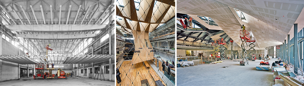
For The Daniels Building in Toronto, while the idea of suspension was not a motivating force, the integrative mandates –and lessons– of the Atlanta and Melbourne projects became instrumental in the transformation of the design. When the concrete shell roof structure was challenged, the project was virtually brought to its knees in a moment of truth, as it were, effectively on the verge of compromising the building’s most salient feature. The question, for us, was whether this roof was a materially driven idea, or rather just about the integration of structural, illumination, environmental and hydrological performance; as the latter became to dominate our thinking, we redesigned the structure more economically in steel, while keeping its essential figure and performance intact. Even then, the construction team rejected the proposal, claiming it unbuildable, putting it once again on the chopping block. For this reason, we built a full-scale mock-up in our own studio, proving to them not only that a ruled surface was completely buildable, but that it can also be embedded with a radiant slab that can serve as its environmental system. Composed of a layered system of parts, the steel I-beams with corrugated steel deck, covered with light gauge struts, gypsum board sheets with radiant panels, and a coating of paint. Thus, the paint shows no grain, as such, the most characteristic feature of the building resides in the morphological grain of the roof itself.
CONCRETE GRAIN
If the grain of concrete escaped us in Toronto, it was reintroduced as a challenge in Ramatuelle, where we designed a single-family house overlooking the Mediterranean. What was initially a courtyard building is slipped in section to enable views for both the upper and the lower wings of the house. The slipped sections of the house are held together by two staircases on each corner of the house, while a central court, occupied by a pool serves as a focal point. Composed of three concrete slabs –a lower floor, a main floor and a roof—the house is conceived as an extension of the landscape; indeed, the landscape flows right under the southern facade of the structure into the central court, seamlessly navigating through the living area of the house and up the hill towards an upper terrace.
Indeed, the south façade is not so much a façade as it is a beam, cantilevered delicately by the pool retaining wall that intercepts it in a perpendicular fashion. Here, the structural grain of concrete serves as a significant protagonist for the house, enabling long spans, though apparently monolithic and integral to its typological figure. Without this structural grain, this concrete building that would not stand.
At a material level, we were also curious how concrete, as a material, produces a “tectonic grain”? In our research, we realized that, in fact, the question about tectonic grain can be posed in two different ways, so we investigated both modalities. First, we realized that all formwork produces its own grain, depending on its materiality (aluminum, wood, bamboo), and thus the surface grain serves as an index of the formwork itself. Second, we realized that concrete itself is the result of a combination of elements, including cement, aggregates, admixtures, water, among other materials; for this reason, one can effectively alter its recipe to consider alternative grains that are embedded within its core, not only its surface. Thus, both modalities involve a level of artifice, with certain variables that can be manipulated to create a concrete wall that is at once dematerialized as reconceptualized.
By way of case studies, we researched the main entry area to serve as a catalyst for the design of digital formwork, which can serve to insinuate a rusticated rubble wall, while in fact being monolithic concrete. At the same time, we researched how the density and size of aggregate within the concrete can serve to transform from a smooth finished surface on the interior of the building to a veritable stone wall serving to retain earth in the landscape in the garden areas. These two ideas about concrete have totally different implications about what is meant by the tectonic grain.
END GRAIN
When I first went to Rome, I was mystified by the tectonic grain of the streets, the organization of the cobblestone. I didn’t realize that the pattern of arcs had a direct relationship to the body. A builder presumably sat on his or her knees and the reach of their arm length defined the radius around which each arc would be defined. For over 2000 years there has been this direct relationship between what is constructed and the body. Even the tagging of graffiti on the side of the wall is a direct imprint of the reach of the arm. However, we’re now witnessing a very special moment where 3D printing is beginning to eradicate the limits of the tectonic unit. No longer are we necessarily defined by 4-by-8 sheets or other industrially manufactured products. We may yet to be able to print out different functionalities within the cellular structure of the 3d print, no longer limited to the laminar layering of constructed wall systems. What seems interesting right now, is the possibility that everything I’ve said in this lecture may become irrelevant.
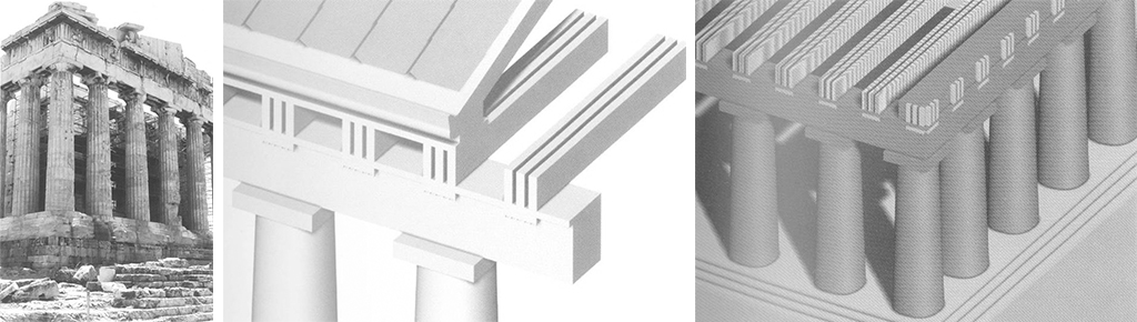
I end here with an image of the Parthenon, and my fascination with actual structure, purported structure, and symbolic structure. When I first came to architecture school, I had no idea how the triglyphs functioned. I thought they were just ornaments. Later, I discovered that they are, in fact, an index of the end-grain of the beams just behind, spanning the entire structure; all of a sudden, they acquired a resonance that had a profound impact on me. The beam’s presence is imprinted in the temple’s stone skin. But why would the wooden beam be registered in stone when we know that the actual spanning structure is composed of wood. The petrification of the wood end grain, in the guise of a triglyph, is part and parcel of what architecture does—and what architecture does best, I should add. It suggests that the structure might be in service of the ornament, not vice versa: that, somehow, the truth of the building is imprinted in this narrative, composed of a blend of fiction and actuality.
And just when you think you’ve understood it, it throws you another curveball. As the motif of the triglyph turns the corner, the very narrative that upholds the truth of the fiction collapses. We know perfectly well that the beams behind these triglyphs cannot be spanning in both directions at once. This is the magic of the tectonic grain, where both the actual and fictional structure come into a dialogue in that we call “architecture.”